The Atfront redesign was a dream project. A small enough scale that I could own the whole process; a trusting and open-minded client; a timeline that encouraged productive urgency without a sense of being rushed.
Dani and Peter of Atfront allowed me to bring my entire creative repertoire: branding design; illustration; photography; responsive web design; motion graphics and high-fidelity prototyping.
Here’s a short breakdown of the project:
Corporate Identity
I had been secretly cooking up logo designs for months leading up the actual redesign kickoff. Their original logo seemed sorely outdated and failed to convey the newfound level of expertise and status that the agency had acquired in their 14 years of work. I also inveighed against the missed opportunity to use a capital A for all its triangular strength.
Here are some of the results of early ideating:
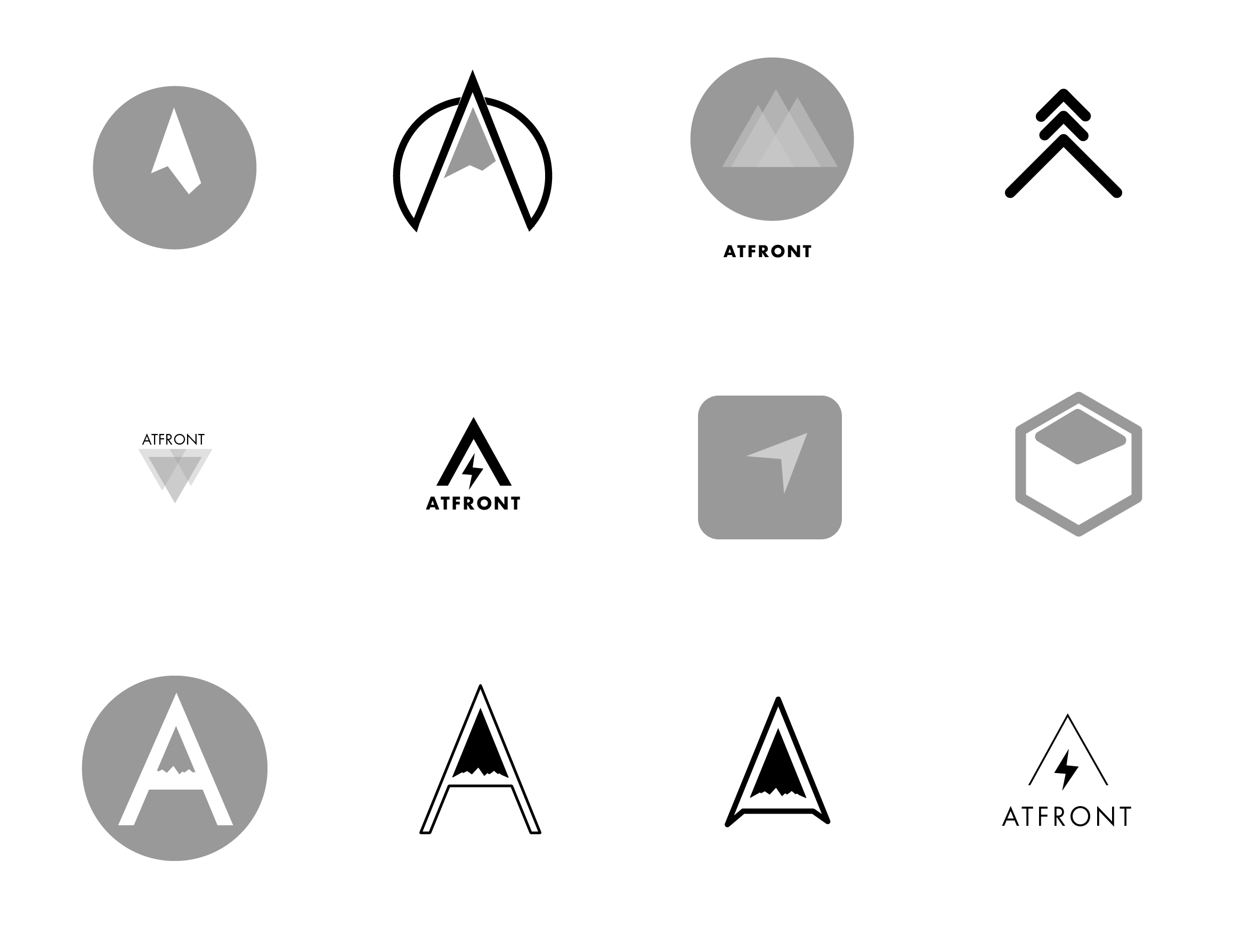
We ended up with something I believe conveys authority, modernity and velocity—along with a color palette that allows for emotional warmth when needed.

Information Architecture
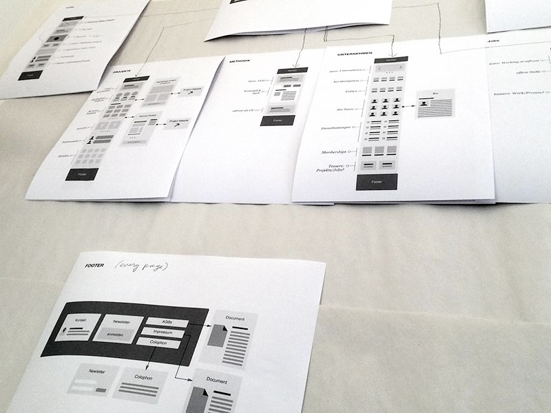
The next step was to structure the site. Based on initial feedback on what the owners wanted the site to convey, I used a simple wireframe kit to map out the site and tape it to the wall. This map became an invaluable reference point for the rest of the design process.
Illustration
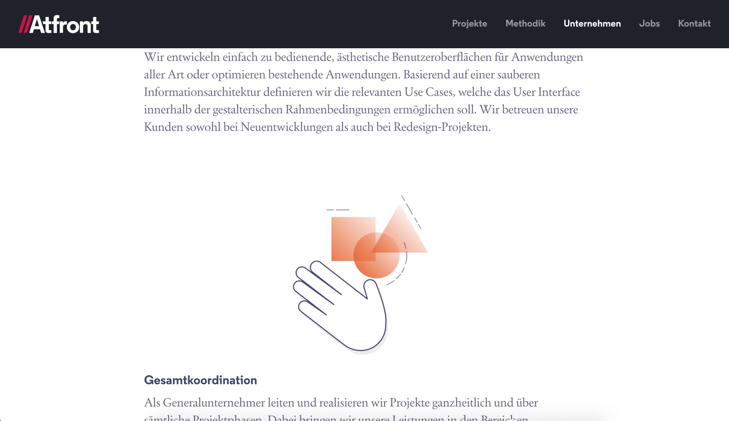
I knew lots of the site’s content was going to be rather technical explanations of the agency’s process. It was important to me to offset the text (which I knew many visitors wouldn’t read) with an element of human warmth—and help visitors gain quicker access to the concepts—through illustrations.

Photography
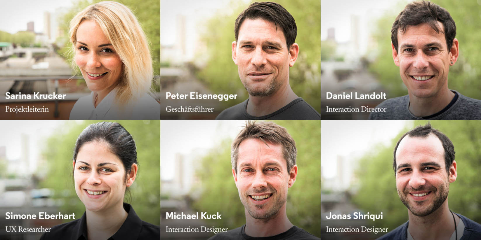
To take advantage of the warm natural light of Spring, as well as the agency’s new terrace, I shot the team portraits outside using my Canon 5D and the reverse side of a whiteboard as a reflector. In Adobe Lightroom I tried to make the photos feel a little bit more magazine-y.
Motion Graphics
Using Premiere and After Effects, I created a short teaser of some of Atfront’s recent projects to display on the front page of the site.
Responsive Design In The Browser
During the design process, I wanted the team to be able to view my work in its native format—web pages—on whatever device they had on hand. So I used a static site generator to build a prototype that looked and functioned exactly as the finished site should you can hear me talk about my process a bit here. Most of the actual design work for the web site was done in code. The prototype later served as the reference for the development team when they build the production code.
Links
My responsive prototype: https://lab27.github.io/atfront-redesign
The current Atfront site: http://atfront.ch