Collecture is a brand new web and mobile lecture-capture solution with headquarters in Zürich. I was asked to create their corporate identity and develop a new UX/UI for the app and platform.
The Corporate Identity
After an initial period of gathering inspiration and sketching wildly, I arrived at a proposed logo mark that suggested the Zen “Enso” which reflected the simplicity of use for which the product strove on the one hand, as well as the fact that the founder of the company is an ordained Zen monk.
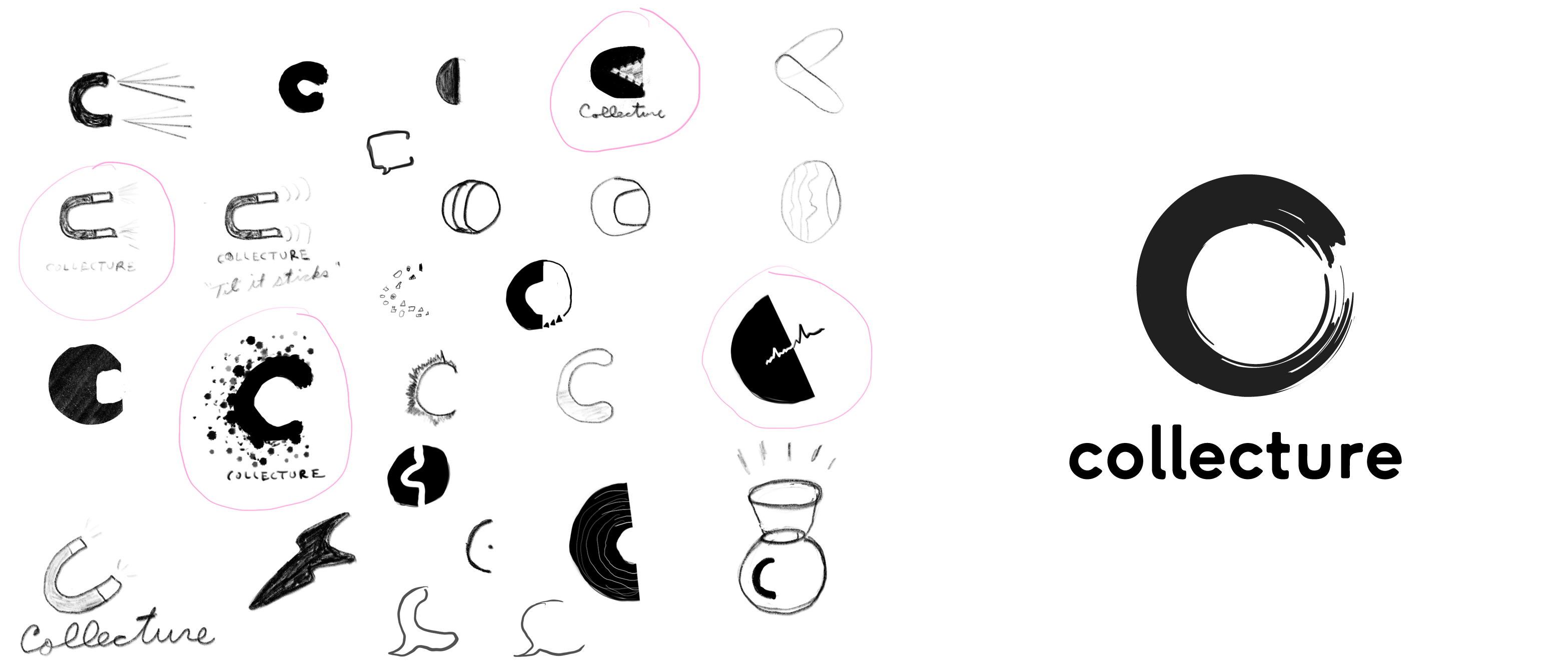
Early logo sketches and a first version.
What we quickly found, though, was that the detail of the brush stroke didn’t translate to smaller use cases—such as mobile app icons. I began an exploration to adapt the physically nuanced Enso to something more iconic.
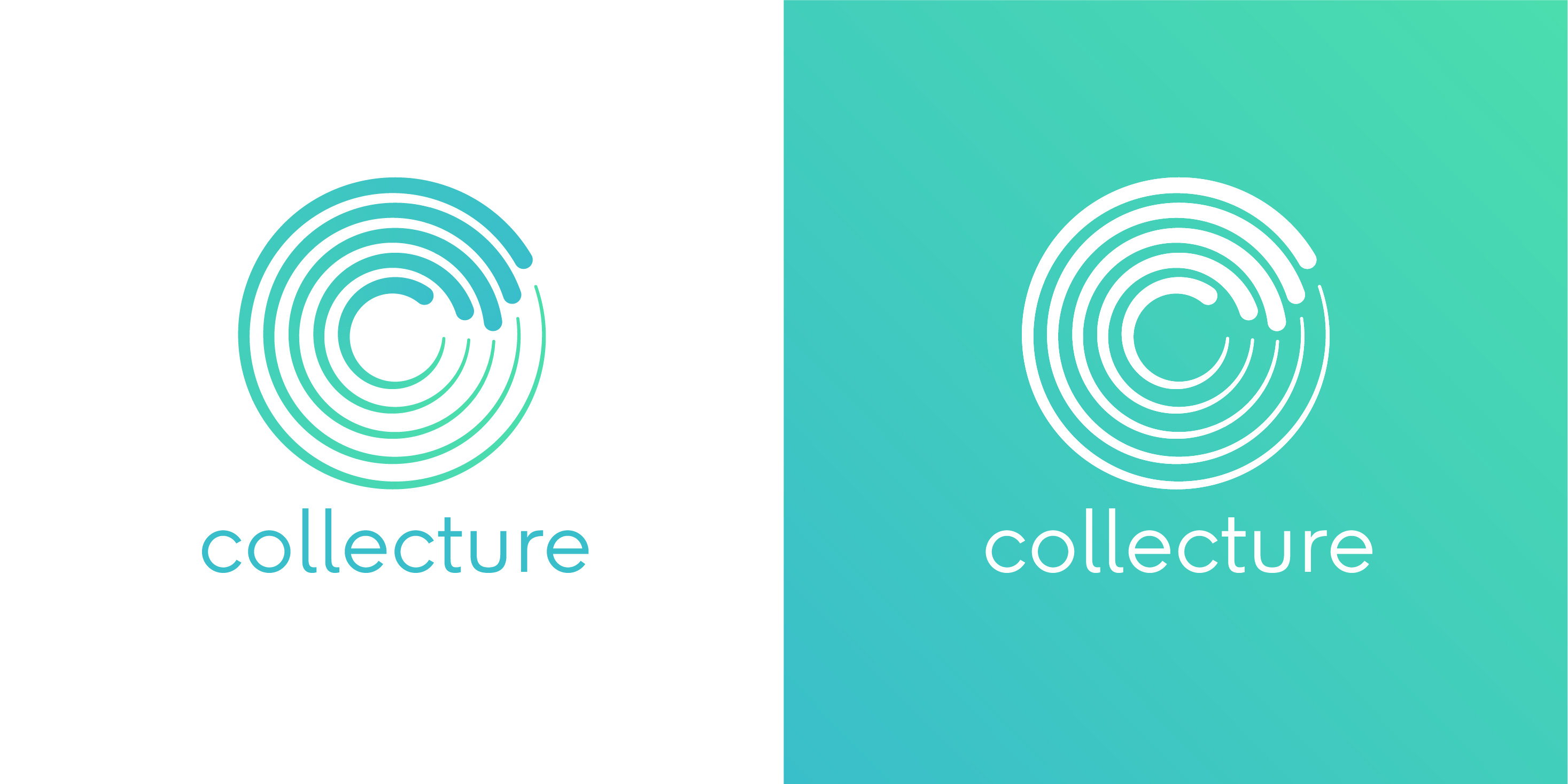
The final logo.
I reduced the brush stroke to five concentric, open rings which narrow along their length. One ring for each finger on a human hand. This has the combined effect of resembling the “C” in Collecture, as well as suggesting a circular “swiping” gesture that evokes the act of collecting.
The primary colors—bright blue and green—are there to evoke positivity, trust, and institutional reliability.
Product Design
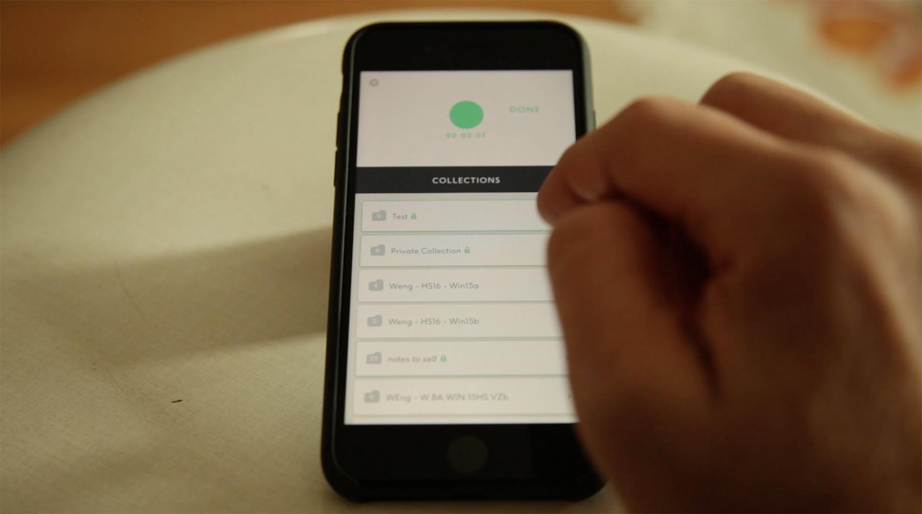
The first version of the Collecture app was essentially a technical prototype, built with React Native and a Material Design framework. As such, some of the interactions followed the logic of the technical solution, rather than what was most convenient or intuitive for the user.
For example, when viewing my list of recordings, the “play” button is hidden behind a floating action button, whereas most users expect to be able to click the recording list item in order to play it. Another example: the dat and time of the recording is stored as the “description” of the recording, which can be overwritten at any time by the user—after which point there’s no user-facing record of that important meta data.
high-fidelity prototype of the new UX.
I proposed a new UX and UI design based on my own test and feedback we were getting from beta users. One of the main differences is the separation of the UI between a permanent recording action area on top and a file viewer on the bottom. This allows the user—normally a teacher or professor who may have only a few minutes between lectures—to quickly begin a new recording without having to relocate herself within the app.
I built a high-fidelity prototype to share and test these new design concepts. You can see me talk a little bit about my process for creating that prototype at a Web Zürich Meetup here: https://www.youtube.com/watch?v=yK1vIqm11nQ.
Landing Page
In advance of a big produce pitch, I created a simple landing page which told the “story” of Collecture’s features using animated SVG illustrations. In the process, I discovered an exciting feature of the SVG specification called the “Foreign Object” tag, which allows you to embed external markup inside an SVG.
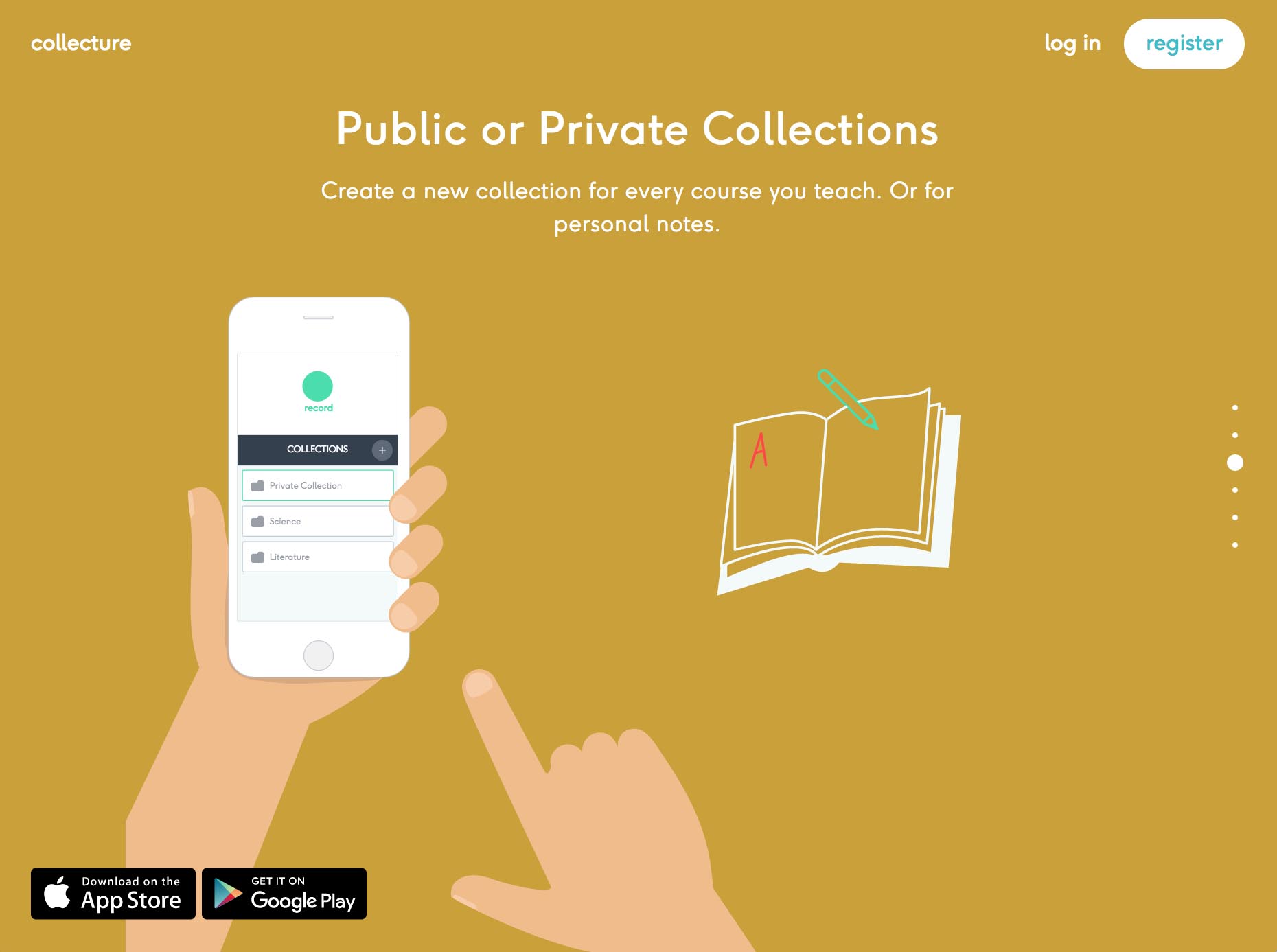
First version of the Collecture landing page with animated SVGs.
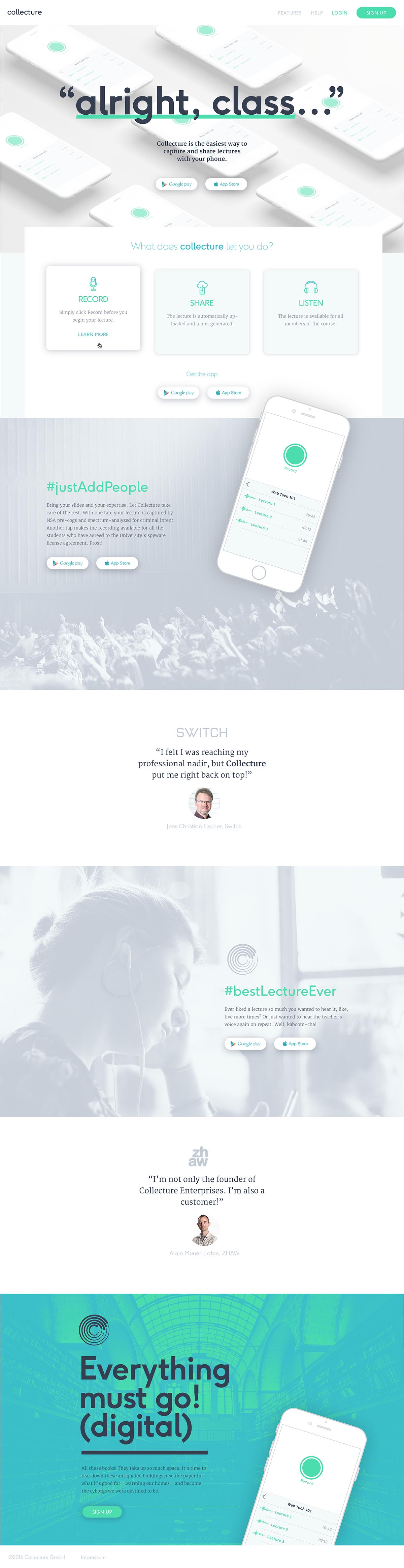
Early Collecture Landing Page Design.
You can view the landing page here: https://collecture.io